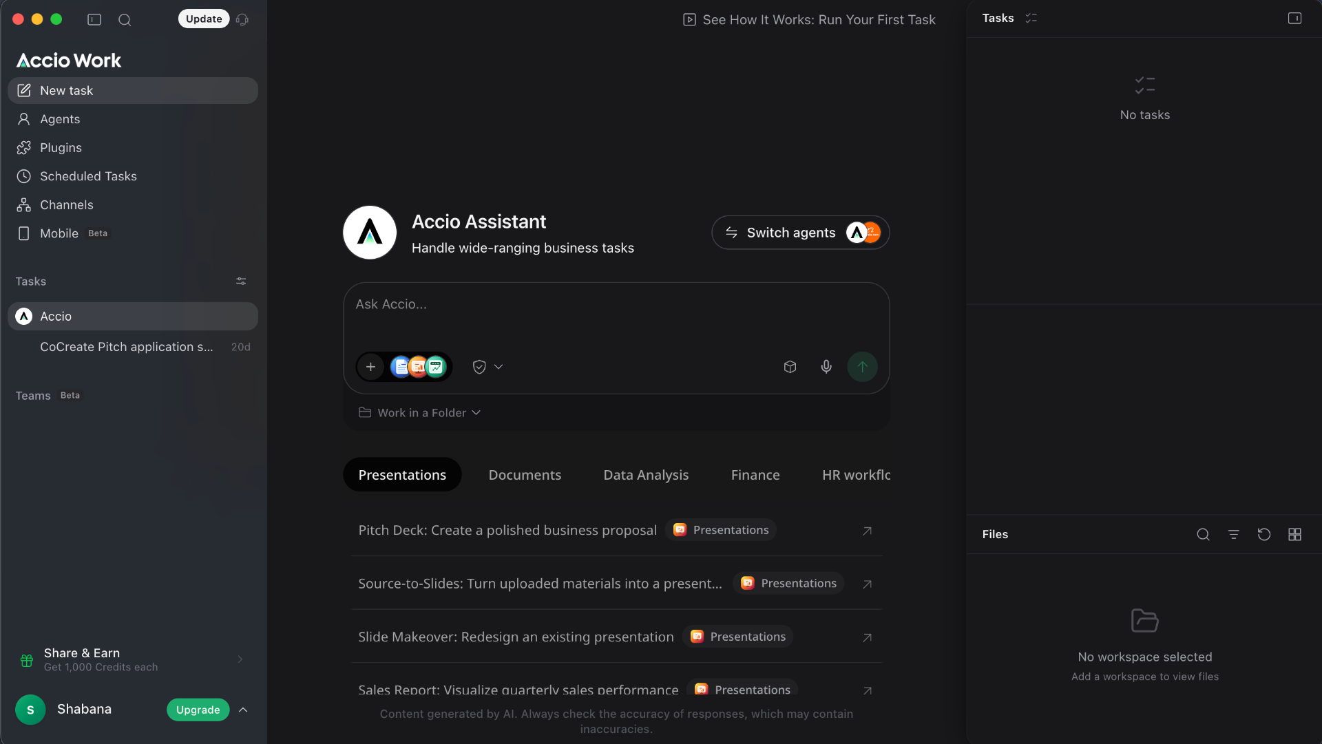
A confident, IDE-style workspace for an agentic LLM — three-panel layout (agents, chat, tasks & files) frames the value clearly, but the dark UI leans heavy on low-contrast greys that hide the moments users most need to trust.
Three-panel workspace (navigation, agent chat, tasks/files) mirrors familiar productivity tools — low learning curve for a brand-new AI paradigm.
Task templates surfaced under the composer (Presentations, Documents, Data Analysis, Finance, HR) turn a blank prompt into a guided first run, reducing cold-start abandonment.
Persistent Tasks and Files rails give users a clear mental model of what the agent is doing and where its output lives — critical for trust in autonomous workflows.
Body and secondary text sit around #8A8A8A on near-black, failing WCAG 2.1 AA 4.5:1 — the exact copy that explains what the agent will do is the hardest to read.
'Ask Accio…' composer lacks visible affordance for attachments, voice and send — icons render as faint monochrome glyphs with no labels or tooltips, breaking Shneiderman's rule of informative feedback.
Empty states ('No tasks', 'No workspace selected') are decorative rather than instructive — no primary CTA, no example, no 'try this first' path, so new users stall at the moment of highest intent.
Lift secondary text to WCAG AA, label the composer controls, and turn empty states into guided first-task prompts — Accio becomes a category-defining LLM workspace rather than a beautiful shell. Modelled uplift: +5–8% activation on first-session task completion.
Modelled from 1,248 benchmarked checkouts and 11 research frameworks.
The same research-backed critique, tailored to your audience. Free.
Analyse my website