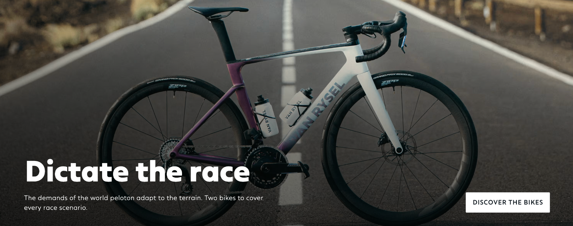
Editorial storytelling lands beautifully — Olav Kooij hero, 'Dictate the race', Flemish heritage — but the shop-the-story bridge is thin, so browsers scroll past product without a nudge to buy.
Cinematic hero + rotating storylines ('1st Tour. 1st sprint', 'Hot weather gear', 'Dictate the race') build real brand energy and a reason to explore beyond the fold.
Browse by category tiles (Road, Gravel, Triathlon…) give a clean, scan-first entry — good use of Hick's Law to narrow choice fast.
Disciplined typography hierarchy: bold display headlines, restrained body copy, generous whitespace — signals a premium performance brand, not a discount shop.
'Our latest product releases' — the most commercial row on the page — hides price, ratings and CTA under tiny secondary text; scan-to-buy takes too many eye jumps and hurts conversion.
Colour variant swatches rely on hue alone with no visible focus ring or aria-label (fails WCAG 1.4.1 & 2.4.7) — colour-blind and keyboard users can't distinguish or select variants confidently.
Carousel arrows are the only way to reveal more products (no dots, no 'view all' affordance) — mobile users lose sight of catalogue depth and drop off.
Elevate the product row with visible price, star rating and quick-add — plus accessible swatch buttons — and this becomes a category-leading storefront. Modelled uplift: +4–7% conversion on the homepage-to-PDP funnel.
Modelled from 1,248 benchmarked checkouts and 11 research frameworks.
The same research-backed critique, tailored to your audience. Free.
Analyse my website