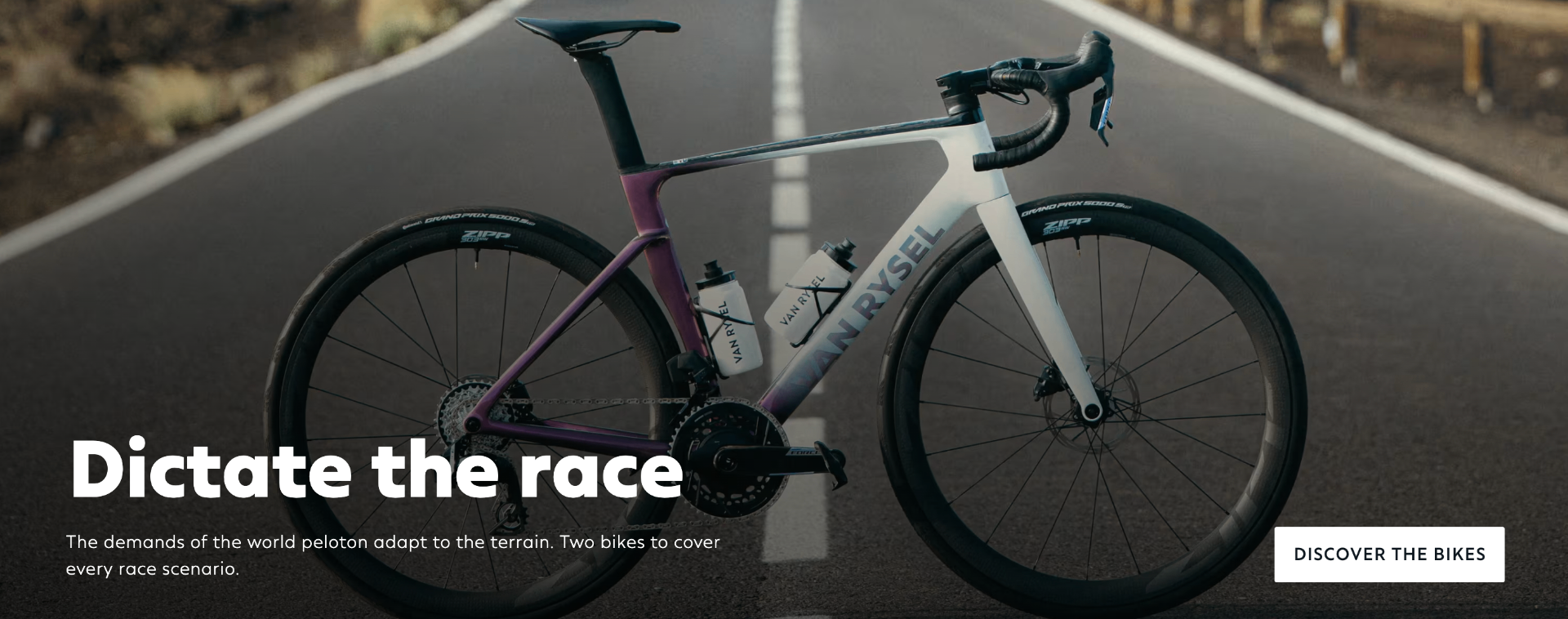
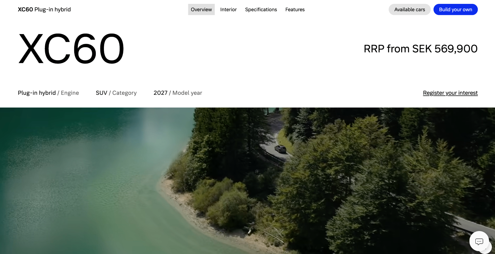
Volvo's homepage opens with a clear offer, a confident product image and direct paths to View offer, View stock and Configure yours. The weak point is the buying journey after that first click, where pricing and delivery reassurance need to stay visible.
The headline, finance offer and primary actions are easy to understand within seconds, supporting fast decision-making for high-intent buyers.
Large vehicle photography keeps the product at the centre of the page and reinforces Volvo's premium positioning without clutter.
The shortcut cards for Current offers, Cars in stock, Configure yours and Book a test drive give visitors practical next steps rather than vague brand messaging.
The offer headline works, but the page should keep monthly cost, availability and next-step reassurance closer together once the visitor moves into stock or configuration.
Some lighter navigation and secondary text risks being missed on bright imagery, which weakens accessibility for a premium purchase journey.
Delivery timing, retailer support and reservation confidence are not visible enough near the main purchase actions.
Keep the strong Volvo homepage structure, then bring price, availability and delivery reassurance into the same decision area as Configure yours and View stock. That would reduce uncertainty and move more visitors from browsing into qualified purchase intent.
Modelled from 1,248 benchmarked checkouts and 11 research frameworks.
The same research-backed critique, tailored to your audience. Free.
Analyse my website